March 16, 2012
Just back from Ghana with the IDEO.org Ghanasan team, communication designer Joseph Shipp leads the team on a redesign of the Clean Team logo.
Back from Kumasi and mostly recovered from the jet lag, our IDEO.org" target="_blank">IDEO.org" target="_blank">IDEO.org team is now shifting from design research to full-on synthesis and design. We are inspired from what we heard in the field in Ghana and have a clear idea on next steps, including some revisions to the current Clean Team logo.
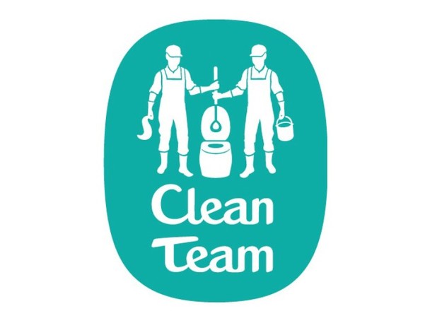
One thing we heard in the field was overall positive responses to the current logo. Given that a majority of potential customers are illiterate, having a mark (aka, logo) that symbolizes the product and service is key. During the last phase of the project there was a broad exploration of logo concepts, and, in my opinion, they were able to get the mark to a really good place. This mark, which is currently being used by the Clean Team, does a nice job of communicating the business' two main features: the mobile toilet and the team of servicemen keeping it neat. These ideas are pretty simple, yet, tricky to execute with sophistication. As good as the current logo is, we have some ideas on how to improve it.
Designers usually jump at the chance to refresh a logo, which often becomes necessary as logos get older (yes, logos age, unless it was designed with Helvetica). My favorite examples of logo refreshers include Starbucks, Prudential, and Radboud University Nijmegen. Each of these examples were able to keep the integrity of their historic logo elements while simplifying and making the mark stronger.
It's been said that half of a designer's job is editing. But, how does one decide what stays and what gets chiseled away? For the IDEO.org Ghanasan team, we listened and and then began to ask questions like this about the existing logo: "What exactly are are they holding, a shovel?" "Is that a knife in his hand?" and "Why are they wearing overalls if the members of the real Clean Team in Kumasi don't wear overalls?"
Our updated logo will aim to achieve better clarity around the toilet and the tools used by the Clean Team, while also simplifying the two figures in the logo for better replication on hand-painted signs (a very common advertising method in Ghana). We anticipate that the new logo will expand the idea of a "symbol" and serve more as an illustration — something not typically sought after in a logo. Still, based upon what we learned while conducting field research in Ghana, we believe this to be the best strategy in this market.
We have a few more weeks before this phase of the Ghanasan project ends, so there's still a chance for further design tweaks. Stay tuned to see how we continue to solidify the Clean Team logo as the brand readies itself for a much larger scale.
--Joseph Shipp, IDEO.org Communication Designer
Photo credits: Starbucks, Prudential, and Radboud University


